ObjectRocket Database Configuration
- April 2016
- Wireframing, UX/UI Design, Prototyping, Usability Testing
- ObjectRocket by Rackspace
- *Image details blurred for NDA reasons
The Problem
Customers needed to choose a configuration for the database they wanted to provision. Configuration parameter options were shown to users within dropdowns - so only one option was visible to the user at a time within each parameter. In addition, each time a dropdown selection was changed, it would reset the others, so unless a user knew exactly what they wanted to configure, it would take a few tries for them to reach the configuration they needed.
Problem Validation
The team had recieved complaints regarding the friction during the configuration process from customers and internal stakeholders, and this was an issue the team had been wanting to solve for a while.
Defining the Requirements
The proposed solution needed to fulfil the following criteria:
- 1. The user should be able to start configuring with any parameter
- 2. All of the options available within each parameter needed to be visible to the user at the same time
- 3. Availability of parameters needed to be communicated clearly
- 4. The user needed to be clearly able to see what configurations were and were not possible
- 5. Any solution I came up with would need to be tested in an area of smaller impact before it could replace the existing solution
Sketching Solutions
Various ideas involving natural language forms, drag and drop, check-boxes, radio buttons etc. were sketched or wireframed. Based on informal testing and internal feedback, radio buttons seemed like an option that could be further explored since only one option within a parameter could be selected by the user.
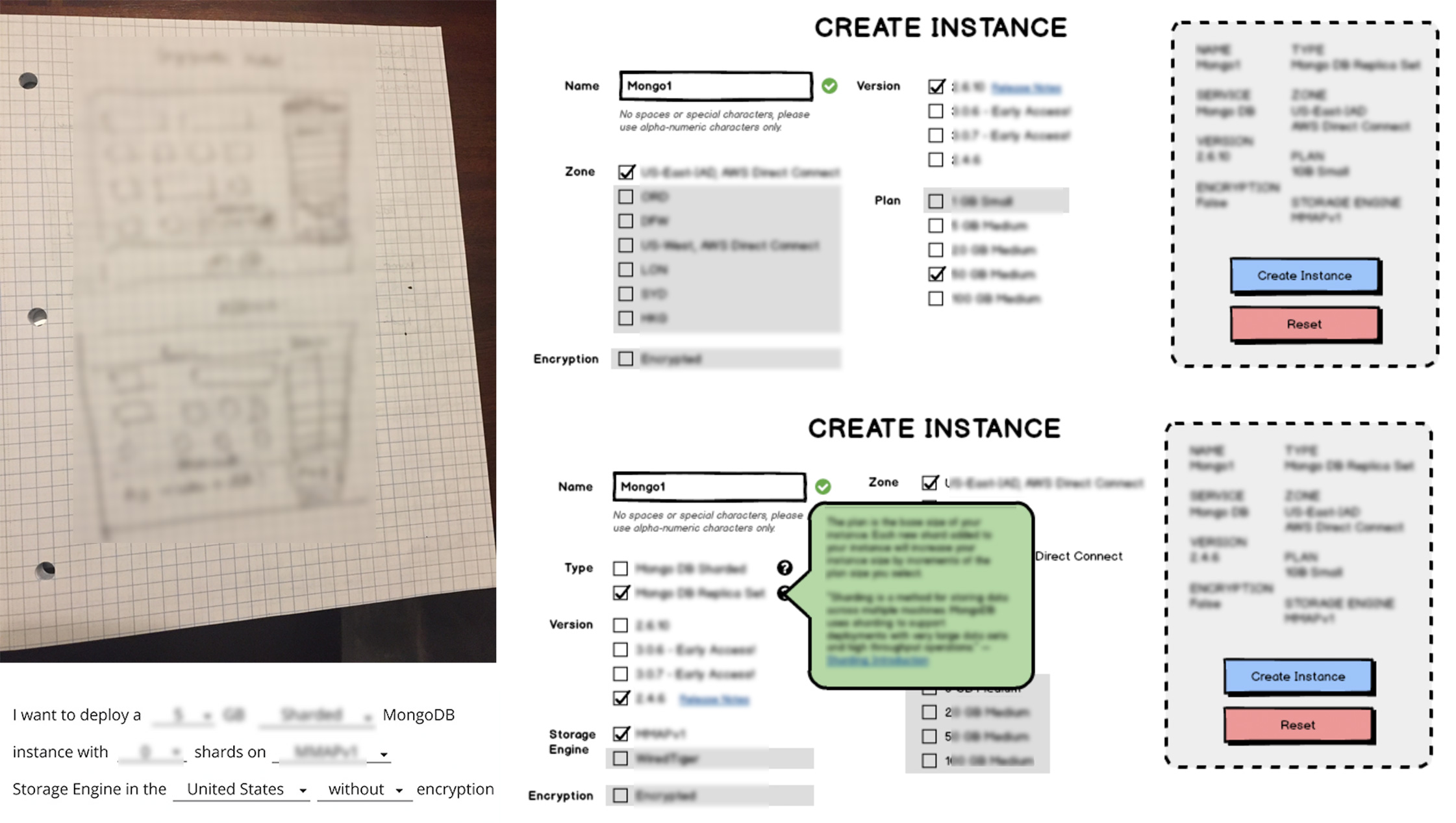
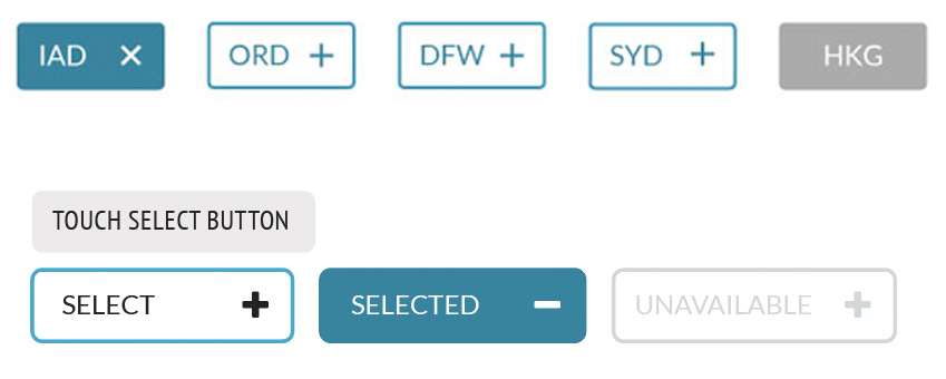
Increasing Interactivity and Meaning
Radio buttons have been around for a long, long time and they're not the most slick looking of UI components, so they had to be repackaged in some way as to make them interesting for the user to interact with. I decided to start with "selectable" buttons that would dynamically change state between "unselected", "selected" and "disabled" based on the user's input.
Wireframes
Wireframes were created around this idea, and passed around for feedback. General consensus was that it was an innovative solution, and something our competitors didn't seem to have at the time, and that as a solution, it met more than two points of the criteria we had specified.
I played around with the idea of differentiating the parameters by color, but found that this could be visually too overwhelming on the eye, especially since there might be a large number of options for certain databases. I decided to narrow the color palette considerably, and perhaps play with the button states based on stroke and fill or perhaps add an icon.
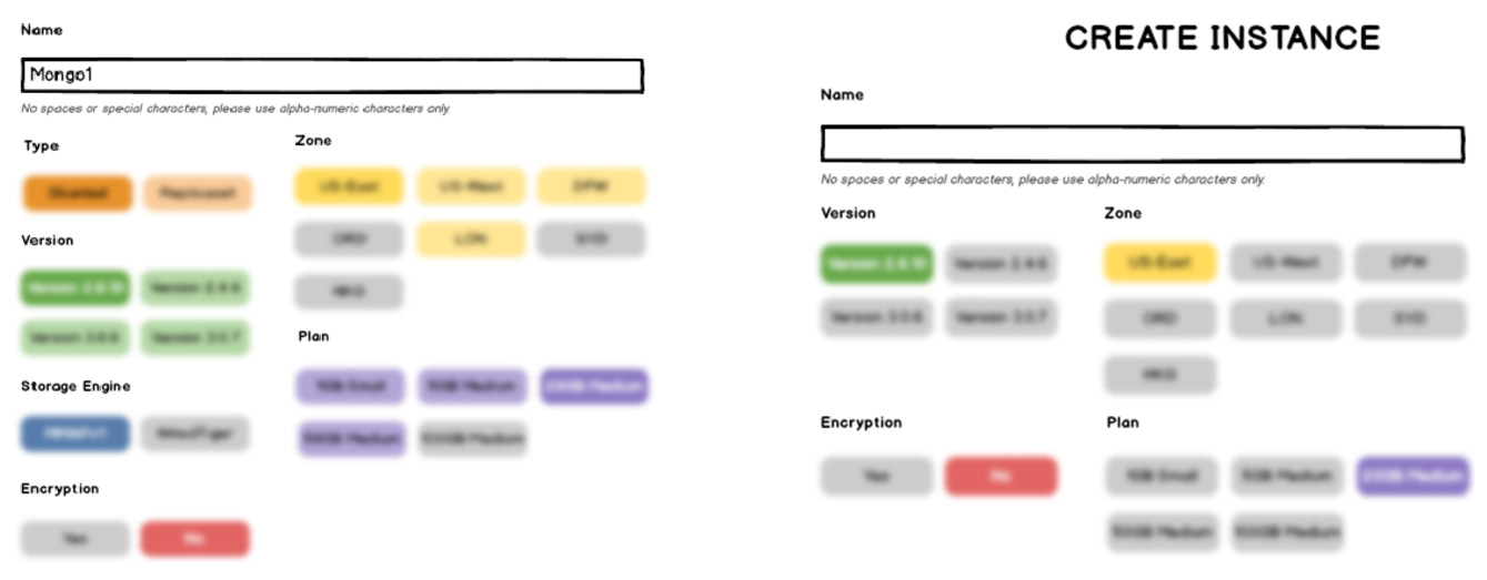
Designing the Buttons
A couple of versions selector buttons were designed based on other buttons in the style guide, and were differentiated with the use of an icon on them to indicate that they fulfilled a different purpose.
I then incorporated them into some high-fidelity screen mockups to make sure that they did not look overwhelming when there were a number of them on the page. I also wanted the selected options to be clearly indicated.
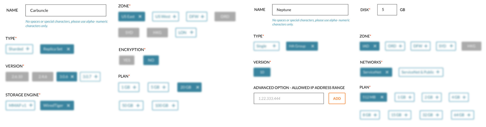
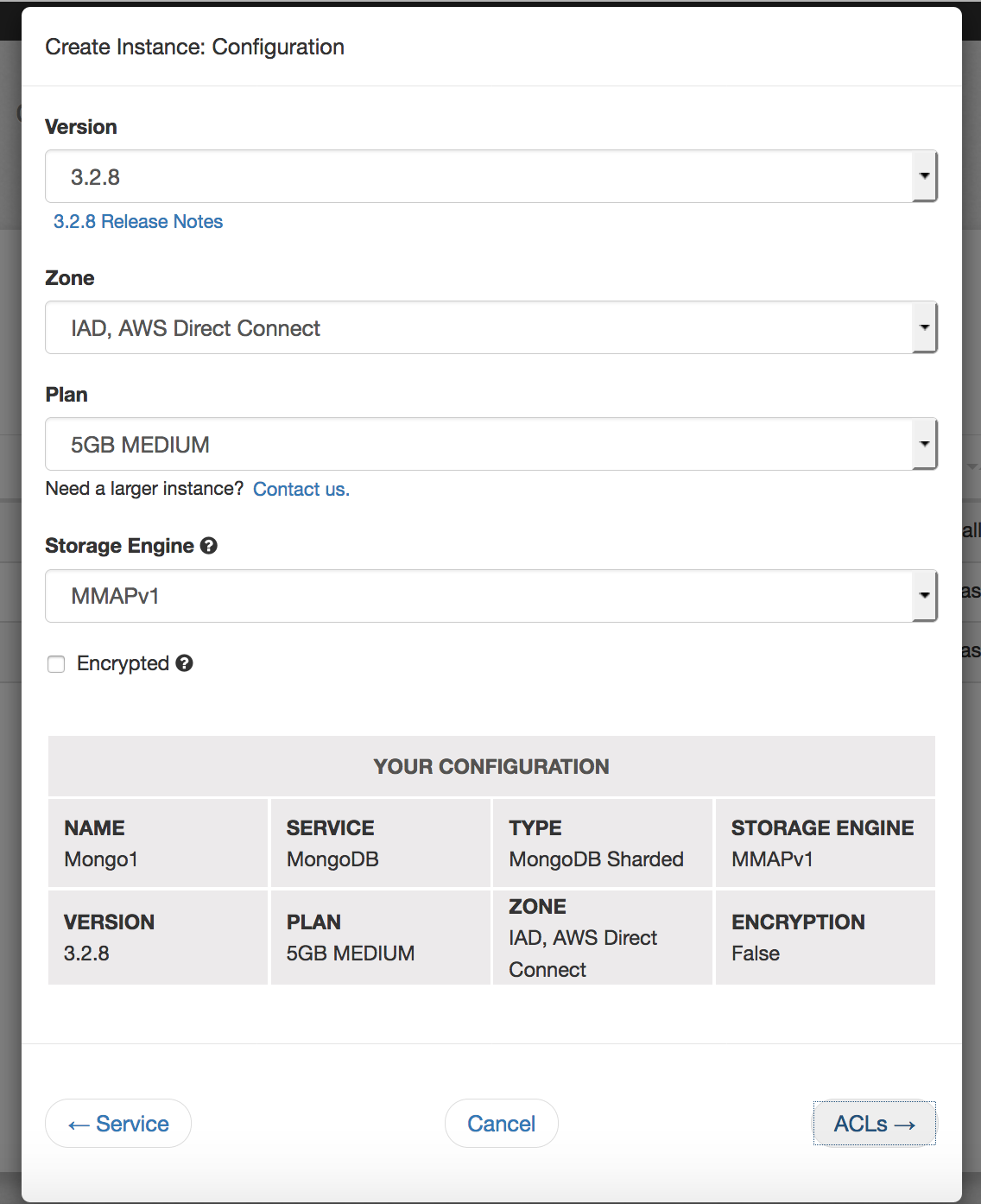
Mapping the Configurations
I then went through all of the possible incantations that could be configured, and their availability map so I could reflect the correct permutations in my mockups.
Interactive Prototype
Based on the configuration mapping, I had to then choose where in the application this solution could be implemented, without impacting the existing configuration process.
We were in the process of building out a new free trial flow, and we had trial database configuration screens that could be used as a testing ground. It wasn't ideal since we would then have 2 different ways of the same process, but given the constraints, this seemed like the most viable option.
I built an interactive prototype of high-fidelity mockups showing the solution and the behavior of the buttons and their relationship with one another as a proof-of-sconcept for idea/solution validation.
Interactive Prototype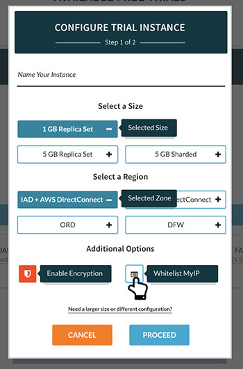
Implementation and Testing
The solution was implemented as part of a new free trials flow, since the technical debt in the existing database creation process was considerable, and I wanted to make sure this was a viable solution before impacting an existing process that customers had familiarity with. A usability test was conducted, and it revealed that while the solution resulted in an increased understanding by the user, the icons on the buttons were confusing and we also hit some issues with the behavioral relationship within a configuration parameter. I created a revised design for the buttons, currently being implemented for review and testing.
In the meantime, as an iterative step, a configuration summary was introduced into the existing screen in an effort to increase clarity for the user on their choices.
Back to Portfolio