Mobile App : Android
- March 2014 - April 2014
- Wireframing, Interactive Design, Visual Design
- Vigyanlabs Innovations Pvt. Ltd.
The Project
The company's mobile app for device power saving had been released to market, but there was no style guide or cohesion with their brand, the graphics needed a clean, updated look-and-feel and the lack of consistency in colors, fonts and navigation across screens had to be corrected. The team wanted a complete overhaul of the app's look and feel.
Research & Observation
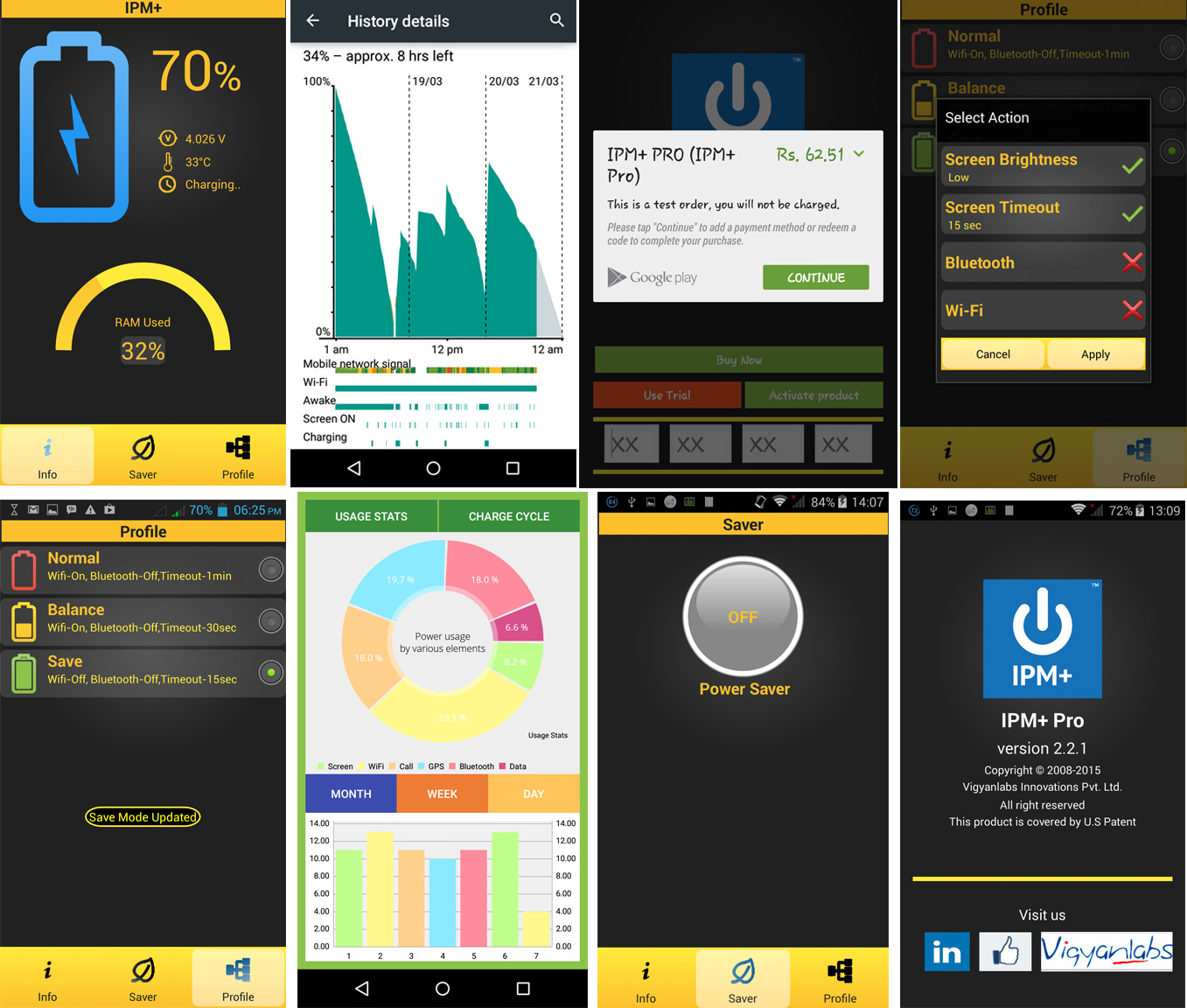
The team wanted to clean up the navigation map and flow, so I installed the app, cataloged the existing screens and flow along with observing how the screens behaved, load time, notifications etc. and worked with the team to formulate a new navigation map where the screens were laid out in more intuitive groups as well as identify where it could be improved in functionality. To the right are screenshots of what the app originally looked like.

Wireframing
The timeline on the project was short, so I jumped directly into creating general wireframes for the unique page layouts on the app, keeping the styling and elements as consistent as possible across screens.

Colors & Typography
I decided to keep it simple, since we were on an aggressive timeline, and recommended that we go with Roboto for typography since the app was only being built for Android. I also created a color palette based on the primary logo color.
The New Design
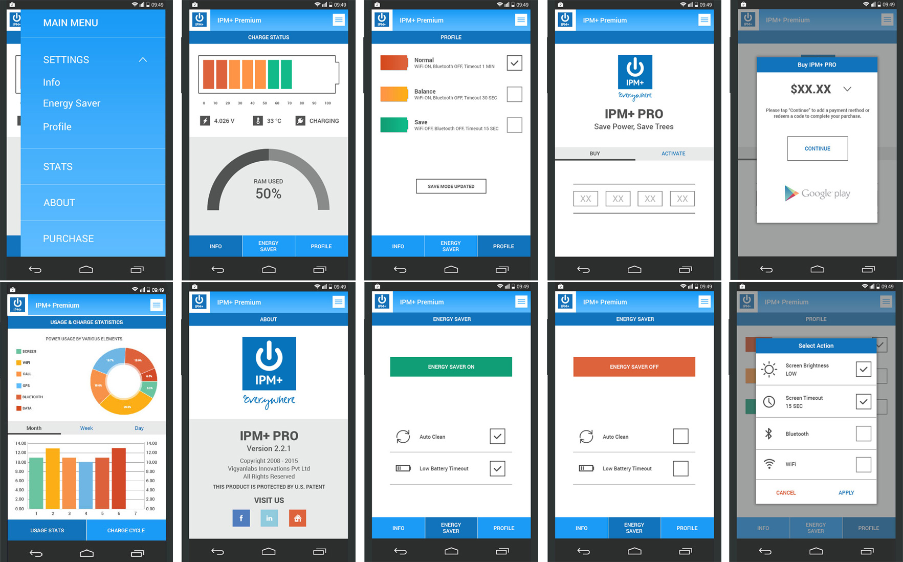
Once the wireframes and the color palette had the team's approval, I created high-definition mockups of the screens to hand over to the development team. Barring minor changes, the team loved the new design I had come up with.
The screens were handed off to the team for implementation, but I was not involved with that part of the project other than to provide feedback on visuals and styling during development.

Back to Portfolio
