Identity Design Case Study
- June 2013 - August 2013
- Identity Design
- Lotus Coating Systems
The Design Brief
The company is a manufacturer of innovative coating solutions to protect indoor and outdoor surfaces in various contexts. The company was particular about incorporating a lotus in the imagery, since it represented purity and alluded to the non-toxic aspect of the coating solutions and wanted it to also have a "scientific" flavor since thier formula was revolutionary and unique.
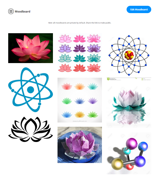
Brainstorming
When I think of anything chemical, the first thing that comes to my mind is either an atomic structure or some sort of lab apparatus. The lab apparatus was too literal an interpretation of a chemical formula and so I decided to go the atomic structure route. I built a moodboard of images of both components that needed to work together for the logo to conceptualize what the client wanted.
Sketches to Concepts
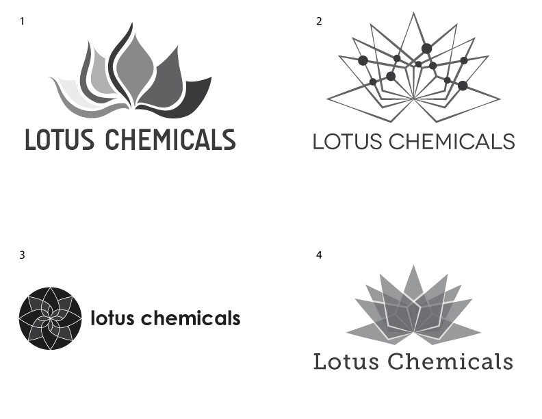
I started with sketching some initial concepts on paper, and playing with the idea of fusing the atomic structure with the lotus as well as some abstract representations of the actual flower.
My process always involves presenting the concepts or basic ideas without any color, because I feel that color is a distraction in the early stages. The concept has a better chance of receiving meaningful feedback when people don't get hung up on the colors.
I do however start to introduce the typography at the very beginning, because I find it challenging to fit a type to the idea at a later stage. In keeping with the ideas of gentleness and purity, I chose font families with more rounded forms, and because I always like a point of contrast, chose one that was stronger, heavier and more a display typeface. This to me conveyed strength and durability, which is important in surface coatings, right?
At the end of this first stage, I presented 4 concepts - 2 of them were representations of just the flower, and 2 incorporated the atom idea.
Client Curveball
The client felt they needed the concepts to be presented in color in order to make any decision at all. The only clue I had of their preference is that they were maybe leaning towards concept 3 in terms of form.
The client wanted options in "bright colors". So, I began exploring various color options. I was leaning towards blues or greens since those are typically associated with nature, and I felt that one of those would further this idea of purity, or non-toxicity.
During this part of the journey, I accidentally came up with another concept, where it looked like the logo was folded over from the circular frame. In my mind, this was a way to represent the concept of a coating, or something on the surface.
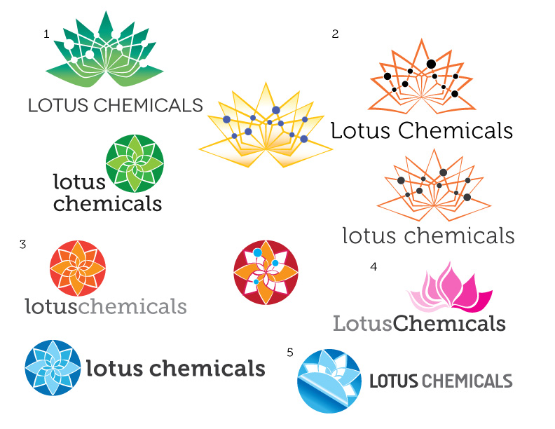
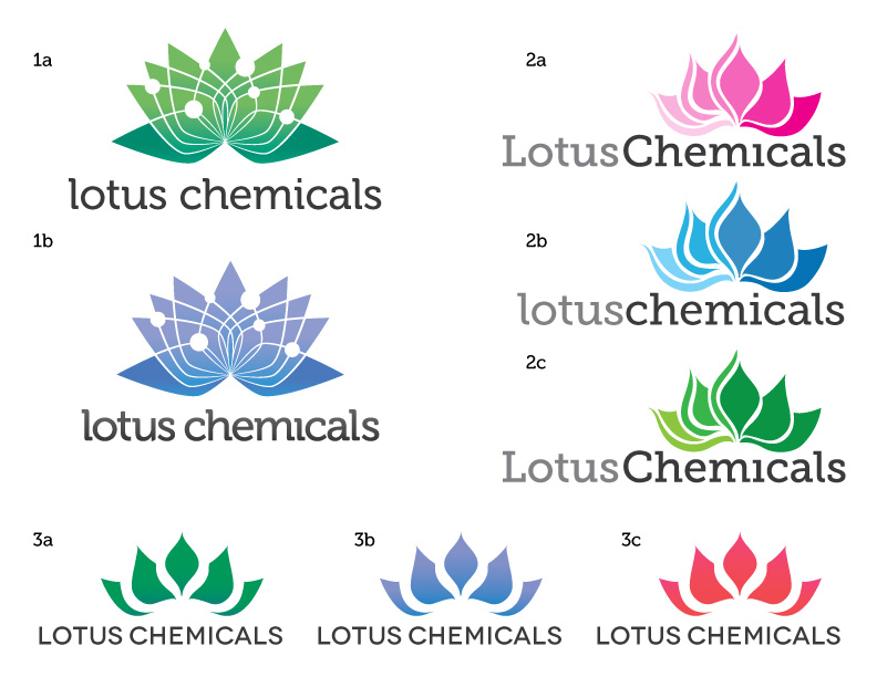
Presenting the Options
I usually lay the options out grouped by concept and numbered, so it is easy for the client to vote, and easy for me to know which variation they are referring to exactly. So, I presented the following, and included the new concept as well, just to see if that would resonate with the client at all.
As for color, I stuck mostly with greens and blues, but wanted a counter point, so had a couple of options in warm colors as well.
Concepts 1 and 4 were the most popular in this round.
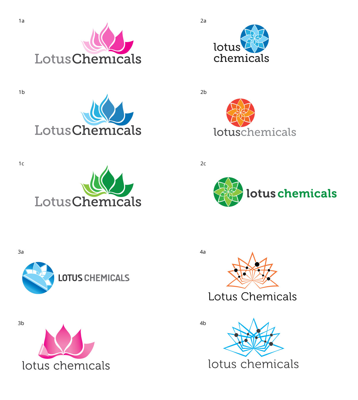
More Options
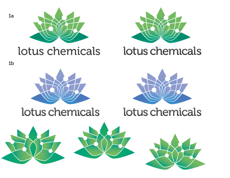
I iterated further on the chosen concepts, and a couple of feedback cycles later, arrived at a form for the logo which I felt I could really take someplace cool.
The warm colors were eventually voted out of the race, so I explored the blues and greens further.
I found that the white lines in the logo had started to look really busy, and there were too many intersections. The idea needed more clarity, so I started simplifying the form, and working on the visual balance of the "atoms".
A number of variations and versions later, I finally reached a point where I felt like the idea was coming through much more clearly.
I had hitched this idea to Museo Sans at the very beginning, and somehow it just seemed to work, since it had gone through so many rounds without a breakup, and I liked how it looked and felt with the image visual.
Customizations & Tweaks
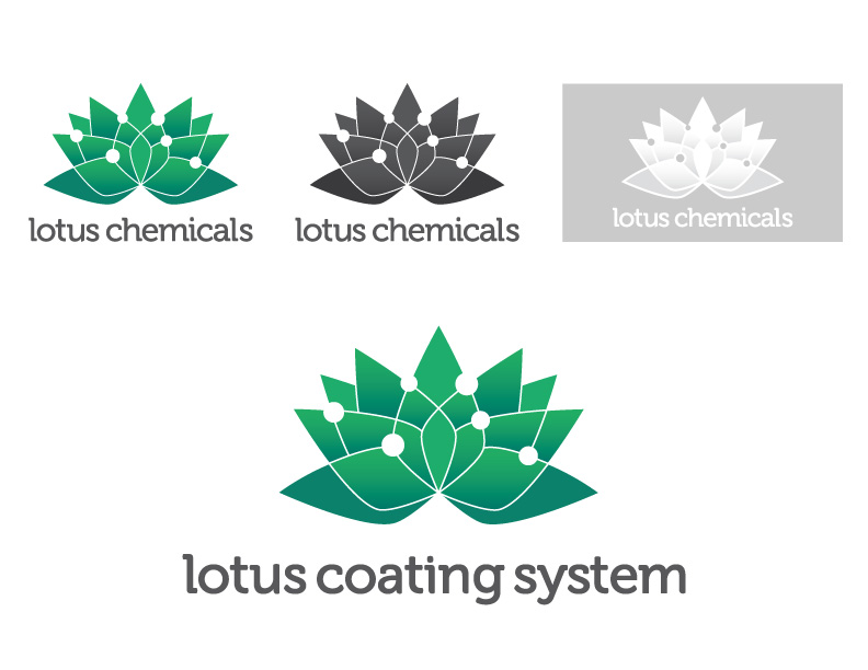
I can never leave the type alone. To me, it seems lazy and unbalanced, process-wise to spend a whole lot of time on the illustration of the concept, but then just slap a font on it with no effort put into it. I always end up tweaking and customizing the letterforms, but usually leave this for the end because it takes me a very long time to arrive at a consistent look and styling. Even if the tweaks I make are fairly minor usually, I'm not an expert font designer.
All refinements later, this final logo was chosen by the client, who was very happy with the result. They later wanted to change the name of the company since chemicals never make anyone feel great, so the final logo is as below.
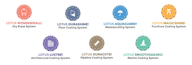
Product Logos & More
Over the course of the last few years, I've done a lot of design work for this client including business collateral, product logos, brochures, datasheets, labels, packaging, tradeshow materials and a website.
This is what their current suite of product logos looks like.
Back to Portfolio